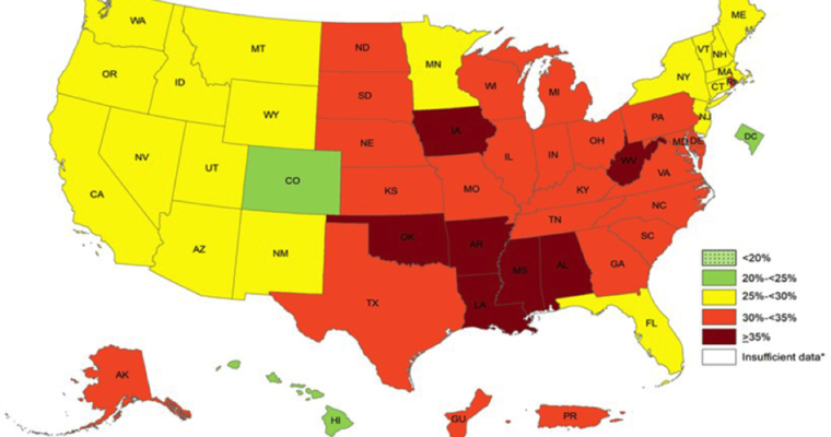
OBESITY ON THE RISE- the trends are alarming!
The above map is an illustration of obesity trends in the US. It is blurry but you can just look at the colors to see where your state stands. Maroon has the highest percentage of obesity; red is next; yellow; then green. The latest data …

